Layout History
Here I will be documenting my previous layouts! Each section is the name of the CSS file that the homepage used.


 plasticdino

Here I will be documenting my previous layouts! Each section is the name of the CSS file that the homepage used.


No images of the homepage available. You're not missing much though, it was just a list of my interests. However, It also had the rainbow header that I still use. If you want to get a rough idea of what it looked like, the meme page uses it. Courier was my favourite font at the time so ofc I had to make that the main font.
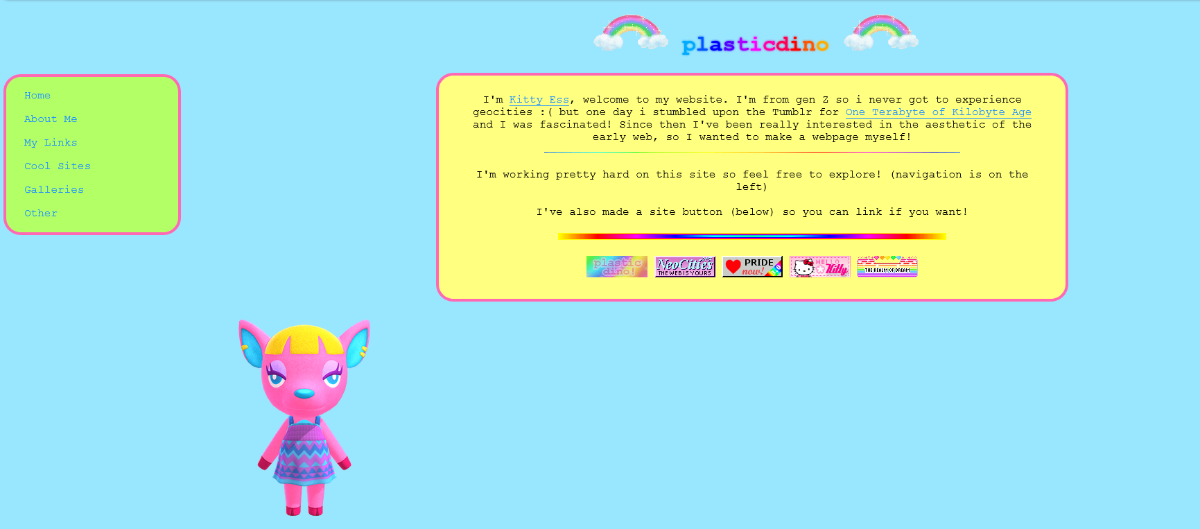
Created in my IT class while I was meant to be doing work :// The college computers blocked neocities and I didn't get how real code editors worked so I just made the entire thing in the w3schools one.
You can still see it on the abandoned log page and it's not the worst thing in the world. The rounded corners and colours were inspired by sites I liked to visit when I was really young, like the Cbeebies website and U.B Funkeys. This is the first appearance of Fuchsia (the animal crossing character hanging out at the bottom of this page) and she will mostly stick around from now on.
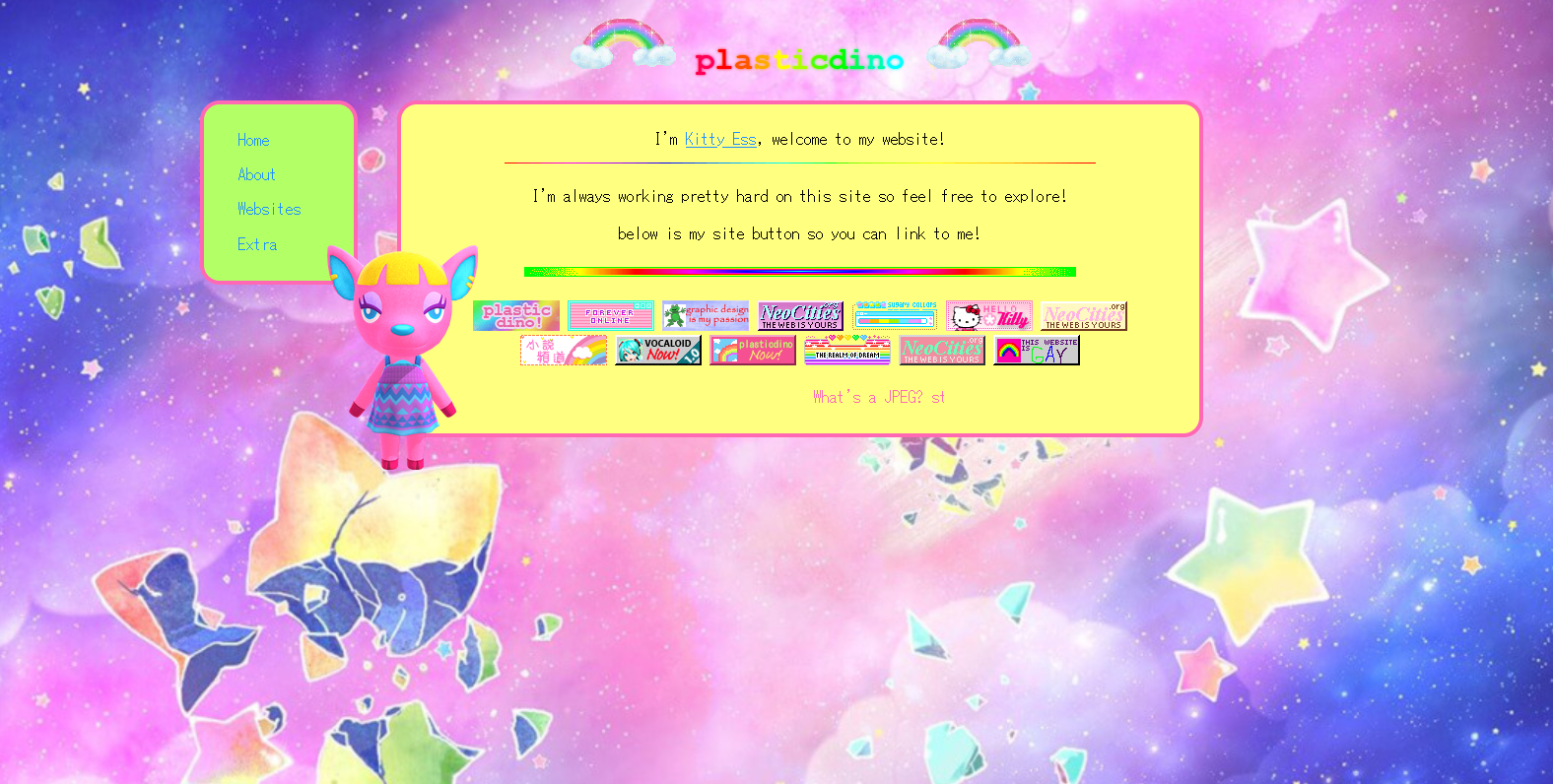
Here the main goal was to try to fix the sidebar. Unfortunately, Fuchsia blocks the sidebar if you look at it on a smaller resolution 😐. The other main change is there's a nice pastel galaxy background now. Plus, the font is MS Gothic. I love this font however it is probably overused on neocities. I still use it as my default font tho. So.
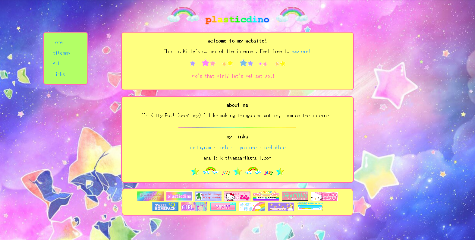
I've skipped over the fourth style because it is extremely similar to third style. This is also quite similar, but there a now more boxes! I think it does look better but I had to take Fuchsia out, cause I didn't know where to put her.
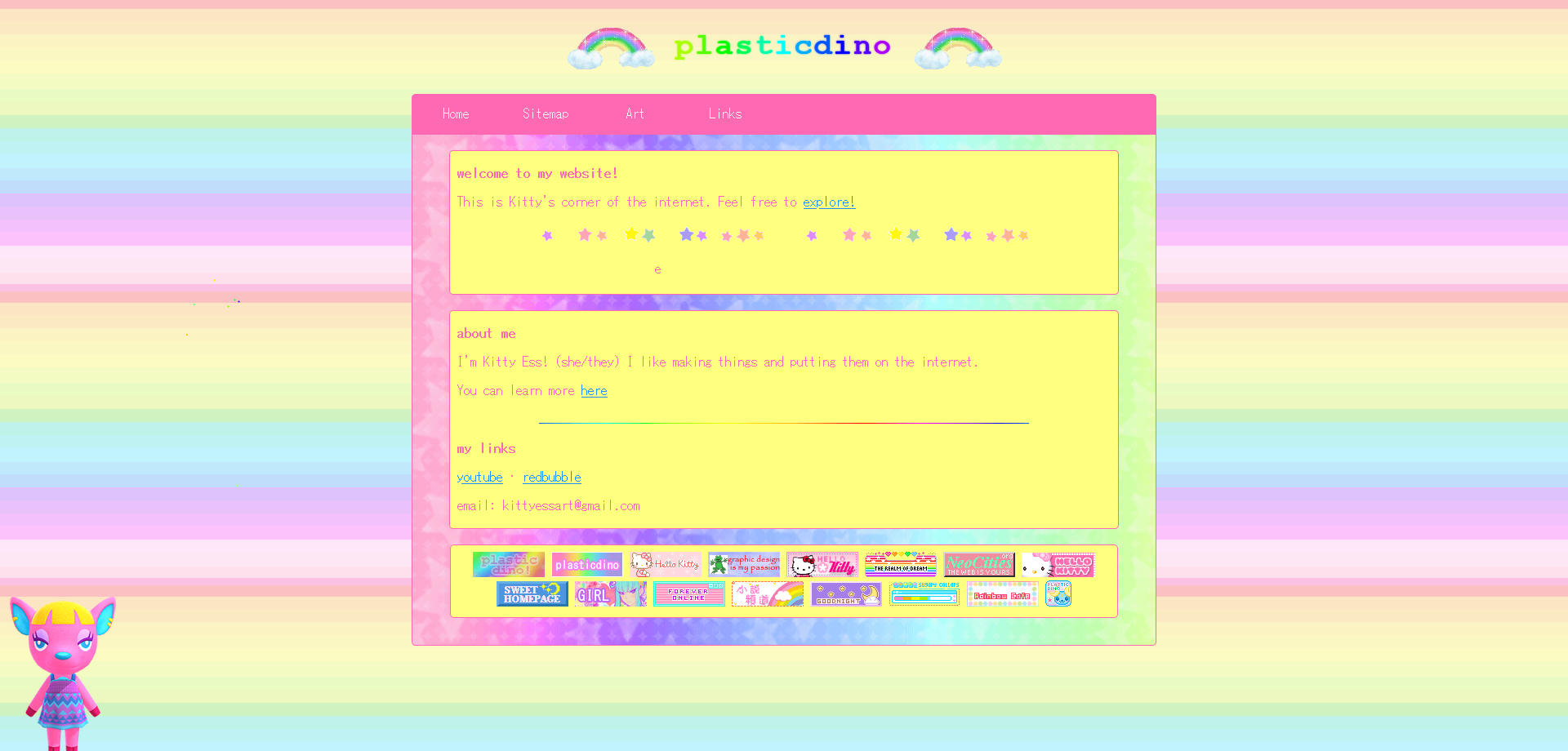
Quite basic looking back on it, but I'm very attached to and proud of this one!! You can see it here. It has all the elements I like about my second layout, but shows that I actually know how web design works kinda sorta! Plus, it's quite mobile compatible, so that's good. I might have kept this for longer but it just wasn't able to support the new design I envisioned for the homepage, so she had to go :'(
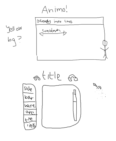
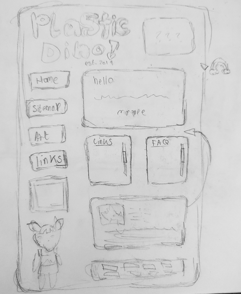
Normally I plan my layouts badly in MS Paint, but I drew my current layout in my school sketchbook. The plan was specifically based on this aikastu layout.